

Next, you'll create a simple element that displays an icon.
In this step, you'll learn about:
- Creating a custom element using Polymer.
- Working with shadow DOM.
Shadow DOM is the set of DOM elements managed by your element. You'll learn more about it in this section.
Read more about shadow DOM concepts in our developer documentation: Shadow DOM concepts
Edit icon-toggle.html
Open icon-toggle.html. This file contains the skeleton of a custom element.
Unlike most HTML files, this file won't display anything if you load it in a
browser—it just defines a new element. The demo imports
icon-toggle.html so it can use the <icon-toggle>
element. As you add features to the element in the following steps, they'll show
up in the demo.
Start by taking a look at the existing code:
Starting code—HTML imports
<link rel="import" href="../polymer/polymer-element.html">
<link rel="import" href="../iron-icon/iron-icon.html">
Key information:
- The
link rel="import"element is an HTML import, a way of including resources in an HTML file. - These lines import the Polymer library and another custom element called
iron-iconthat you'll use later in this step.
Learn more: HTML Imports. See HTML Imports: #include for the web on HTML5Rocks.com for an in-depth discussion of HTML Imports.
Next is the definition of the element itself:
Starting code—shadow DOM template
<dom-module id="icon-toggle">
  <template>
    <style>
      /* shadow DOM styles go here */
      :host {
        display: inline-block;
      }
    </style>
    <!-- shadow DOM goes here -->
    <span>Not much here yet.</span>
  </template>
Key information:
- The
<dom-module>tag wraps an element's shadow DOM definition. In this case, theidattribute shows that this module includes the shadow DOM for an element calledicon-toggle. - The
<template>actually defines the element's shadow DOM structure and styling. This is where you'll add markup for your custom element. - The
<style>element inside the<template>lets you define styles that are scoped to the shadow DOM, so they don't affect the rest of the document. - The
:hostpseudo-class matches the custom element you're defining (in this case, the<icon-toggle>). This is the element that contains or hosts the shadow DOM tree.
Learn more: Shadow DOM. Shadow DOM lets you add a scoped DOM tree inside an element, with local styles and markup that are decoupled from the rest of the web page. Shadow DOM is based on the Shadow DOM specification, and works with native shadow DOM where available. To learn more, see Shadow DOM Concepts in the Polymer library docs.
At the end of the element definition is some JavaScript that registers the
element. If the element has a <dom-module>, this script is usually placed
inside the <dom-module> to keep everything together.
Starting code—element registration
<script>
  class IconToggle extends Polymer.Element {
    static get is() {
      return "icon-toggle";
    }
    constructor() {
      super();
    }
  }
  customElements.define(IconToggle.is, IconToggle);
</script>
Key information:
-
Polymer uses ES6 class syntax. With this code, you extend the base Polymer.Element class to create your own:
class IconToggle extends Polymer.Element {...} -
You then give your new element a name, so that the browser can recognize it when you use it in tags. This name must match the
idgiven in your element's template definition (<dom-module id="icon-toggle">).static get is() { return "icon-toggle"; } -
The element has a constructor:
constructor() { super(); }At the moment, this constructor does nothing. It is included here as a placeholder since we'll use it later.
-
At the end of the script, this line calls the "define" method from the Custom Elements API to register your element:
customElements.define(IconToggle.is, IconToggle);
Create the shadow DOM structure
Now that you're familiar with the basic layout of the element, add something useful to its shadow DOM template.
Find the <span> below the shadow DOM goes here comment:
icon-toggle.html—before
<!-- shadow DOM goes here -->
<span>Not much here yet.</span>
</template>
Replace the <span> and its contents with the <iron-icon> tag below:
icon-toggle.html—after
<!-- shadow DOM goes here -->
<iron-icon icon="polymer">
</iron-icon>
</template>
Key information:
- The
<iron-icon>element is a custom element that renders an icon. Here it's hard-coded to use an icon named "polymer".
Style the shadow DOM
There are a number of new CSS selectors to work with shadow DOM. The icon-toggle.html file already includes a :host selector, discussed earlier, to style the top-level <icon-toggle> element.
To style the <iron-icon> element, add CSS rules inside the <style> tag after the existing content.
icon-toggle.html: Before
<style>
/* shadow DOM styles go here */
:host {
display: inline-block;
}
</style>
icon-toggle.html: After
<style>
/* shadow DOM styles go here */
:host {
display: inline-block;
}
iron-icon {
fill: rgba(0,0,0,0);
stroke: currentcolor;
}
:host([pressed]) iron-icon {
fill: currentcolor;
}
</style>
Key information:
-
The
<iron-icon>tag uses an SVG icon. Thefillandstrokeproperties are SVG-specific CSS properties. They set the fill color and the outline color for the icon, respectively. -
The
:host()function matches the host element if the selector inside the parentheses matches the host element. In this case,[pressed]is a standard CSS attribute selector, so this rule matches when theicon-togglehas apressedattribute set on it.
Your custom element definition should now look like this:
icon-toggle.html
<link rel="import" href="../polymer/polymer-element.html">
<link rel="import" href="../iron-icon/iron-icon.html">
<dom-module id="icon-toggle">
<template>
<style>
/* shadow DOM styles go here */
:host {
display: inline-block;
}
iron-icon {
fill: rgba(0,0,0,0);
stroke: currentcolor;
}
:host([pressed]) iron-icon {
fill: currentcolor;
}
</style>
<!-- shadow DOM goes here -->
<iron-icon icon="polymer"></iron-icon>
</template>
<script>
class IconToggle extends Polymer.Element {
static get is() {
  return "icon-toggle";
}
constructor() {
  super();
}
}
customElements.define(IconToggle.is, IconToggle);
</script>
</dom-module>
Make sure polymer serve is running and reload the demo page. You should see the toggle buttons show up with the hard-coded icon.
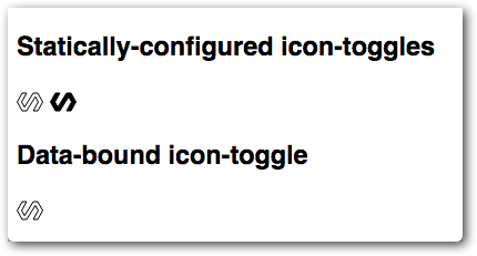
You'll notice that one toggle is styled as pressed, because the pressed
attribute is set in the demo. But click all you want, the button won't toggle
yet; there's no code to change the pressed property.
If you don't see the new toggles, double-check your file against the code above. If you see a blank page, make sure you're clicking on the demo folder or on demo/index.html.
Previous step: Intro Next step: Use data binding and properties