In this tutorial, you’ll learn how to build elements using Polymer 2.0. You’ll create a simple Polymer element, a toggle button. The finished button will look something like this:

You’ll be able to use it with simple markup like this:
<icon-toggle></icon-toggle>
This project introduces you to most of the key concepts in working with Polymer.
Don’t worry if you don’t understand everything. Each of the concepts presented here is described in detail in the Polymer documentation.
Step 1: Get set up
To follow this tutorial, you’ll need:
- git.
- The starting code, available on GitHub.
- The Polymer CLI to run the demo.
Download the starting code
-
Download the starting code by running this command:
git clone https://github.com/PolymerLabs/polymer-2-first-element.git -
Open the project folder:
cd polymer-2-first-elementYour project folder should look something like this:
README.md
bower.json
demo/
icon-toggle-finished/
icon-toggle.html
index.html
The main file you’ll work with is
icon-toggle.html, which contains the definition for your custom element.
Install Polymer CLI
Install the Polymer CLI to serve the demo locally.
Polymer CLI requires Node.js, npm, git and Bower. For full installation instructions, see the Polymer CLI documentation.
To install Polymer CLI:
npm install -g polymer-cli
Install dependencies and run the demo
To install the element's dependencies and run the demo:
-
Run
bower installfrom the repo directory:bower installThis installs the components and dependencies required to use the Polymer library and other web components.
You will now see an extra folder named
bower_componentsin the project directory:README.md bower.json bower_components demo/ icon-toggle-finished/ icon-toggle.html index.html
-
Run the Polymer development server from the project directory:
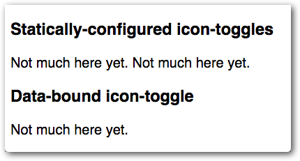
polymer serve --openYou’ll see some text where the icon toggles should appear. It doesn’t look very interesting, but it shows that everything is working.
(Note that the URL includes
icon-toggle—the component name listed in this element’sbower.jsonfile—rather than the actual directory name. If you’re wondering whypolymer servedoes this, see HTML imports and dependency management.)

If everything looks good, move on to step 2.


