Shop is a full-featured e-commerce Progressive web app demo built using the Toolbox. You can try it out here:
This case studies shows how Shop uses the App Toolbox to deliver a great user experience.
App structure
The Shop app is made up of several main views: the home view, list view, detail view, and shopping cart view:
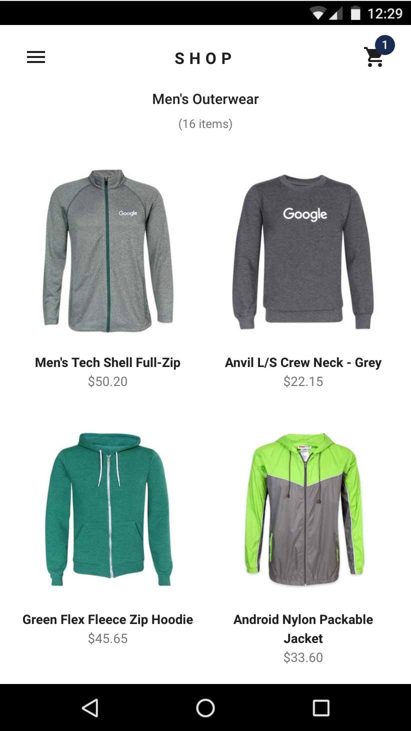
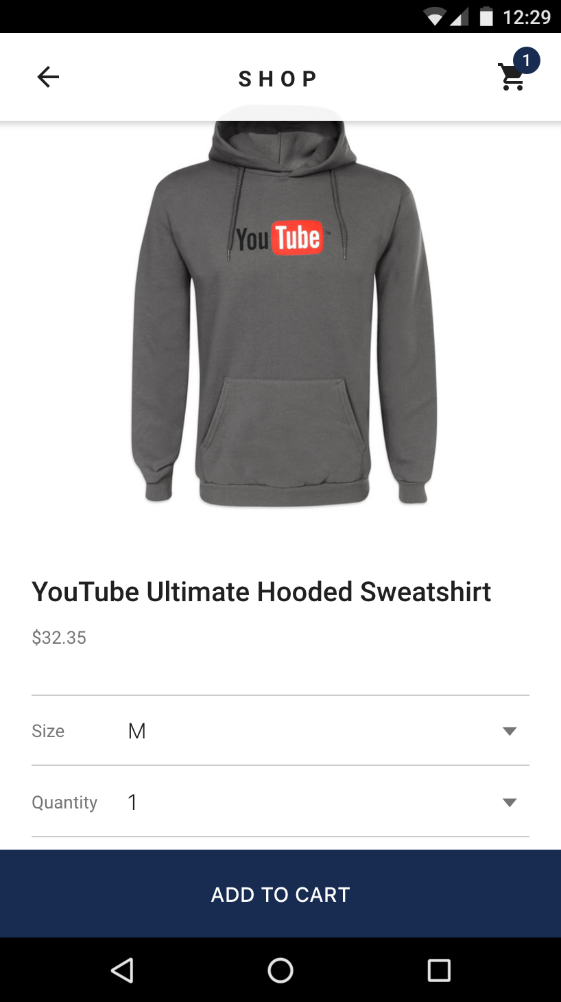
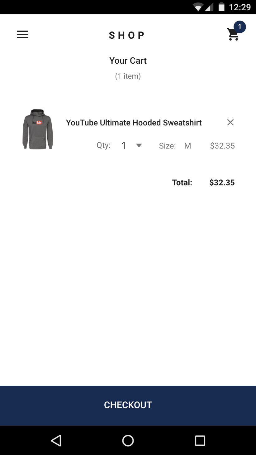
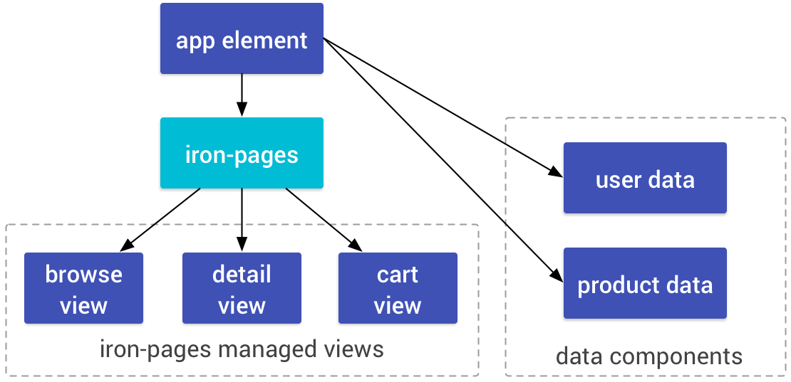
The app uses custom elements as its organizing principle: A top-level
application element serves as the main controller for the app. App-specific
elements build views, such as the browse and detail views. The stores for user
and product data are also implemented as elements. These elements are in turn
composed of reusable elements, like buttons and tabs. Reusable elements also
supply other essential functions, including overall layout and routing. The
<iron-pages>
element controls which view is currently visible.
Routing
Shop's client-side URL routing is based on the
<app-route>
element, a modular routing element. The app element has a top-level
<app-route> element that's bound to the page URL, and selects the top-level
view by setting the app element's page property.
The top-level element delegates the remainder of the route to other instances of
<app-route> that represent sub-routes. For example, when browsing a
category, the top-level <app-route> selects the browse view, and the
second-level <app-route> selects the category to show.
All navigation is accomplished with links (<a> tags) (which ensures that the
app can be indexed by web crawlers). The routing elements handle the URL changes
and pass route data to the active view element.
For example, the path /list/Shoes displays the browse (list) view, and passes
the category "Shoes" to the browse view.
More information:
Views
The main views of the element are controlled by an <iron-pages> element, which
displays a single view at a time. When a view is active, it takes over the whole
content area below the app header.
The <iron-pages>
element is bound to the app element's page property, which is in turn set
based on the current route. The view switching code looks like this:
shop-app.html
<iron-pages role="main" selected="[[page]]" attr-for-selected="name" selected-attribute="visible" fallback-selection="404">
  <!-- home view -->
  <shop-home name="home" categories="[[categories]]"></shop-home>
  <!-- list view of items in a category -->
  <shop-list name="list" route="[[subroute]]" offline="[[offline]]"></shop-list>
  <!-- detail view of one item -->
  <shop-detail name="detail" route="[[subroute]]" offline="[[offline]]"></shop-detail>
  <!-- cart view -->
  <shop-cart name="cart" cart="[[cart]]" total="[[total]]"></shop-cart>
  <!-- checkout view -->
  <shop-checkout name="checkout" cart="[[cart]]" total="[[total]]" route="{{subroute}}"></shop-checkout>
  <shop-404-warning name="404"></shop-404-warning>
</iron-pages>
When the page property is list, the list or browse view is active.
The views are created lazily on demand by taking advantage of the custom
element's upgrade feature. The inactive view elements (such as shop-list
above) exist in the DOM as instances of HTMLElement.
When you change pages, the application loads the definition for the active view. When the definition loads, the browser upgrades the element to a fully- functional custom element.
_pageChanged(page, oldPage) {
  if (page != null) {
    // home route is eagerly loaded
    if (page == 'home') {
      this._pageLoaded(Boolean(oldPage));
    // other routes are lazy loaded
    } else {
      // When a load failed, it triggered a 404 which means we need to
      // eagerly load the 404 page definition
      let cb = this._pageLoaded.bind(this, Boolean(oldPage));
      Polymer.importHref(
        this.resolveUrl('shop-' + page + '.html'),
        cb, cb, true);
    }
  }
}
In the logic above, the home view is built into the app shell, but the other views are demand-loaded fragments.
Shop also uses dom-if templates to lazily create views:
<!-- Lazy-create the tabs for larger screen sizes. -->
<div id="tabContainer" sticky$="[[_shouldShowTabs]]" hidden$="[[!_shouldShowTabs]]">
  <dom-if if="[[_shouldRenderTabs]]">
    <template>
      <shop-tabs
          selected="[[categoryName]]"
          attr-for-selected="name">
        <dom-repeat items="[[categories]]" as="category" initial-count="4">
          <template>
          <shop-tab name="[[category.name]]">
            <a href="/list/[[category.name]]">[[category.title]]</a>
          </shop-tab>
          </template>
        </dom-repeat>
      </shop-tabs>
    </template>
  </dom-if>
</div>
When parsed, the template's content is inert, and not included in the main
document. If the _shouldRenderTabs property is true, the template's
contents are inserted into the DOM, the elements are initialized and their local
DOM trees created. Since the tabs are only displayed on desktop, mobile users
never pay the cost to create elements they're not using.
Theming
Shop uses CSS custom properties and mixins for theming both its application-specific elements and the reusable elements it includes.
Shop defines a few, top-level custom properties to set basic theme colors, which are passed down to other elements.
:host {
  ...
  --app-primary-color: #202020;
  --app-secondary-color: #757575;
  --app-accent-color: #172C50;
  ...
These custom properties are special CSS properties defined by the component
author. The Shop app uses these three properties to define its theme colors.
These values can be used inside other CSS rules using the var() function:
color: var(--app-accent-color);
Custom properties can also be used to set other custom properties.
  --paper-button-ink-color: var(--app-primary-color);
  --paper-icon-button-ink-color: var(--app-primary-color);
  --paper-spinner-color: var(--app-primary-color);
Here, the app's theme colors are passed down to several of the reusable elements from the paper elements set.
If you add more elements to the app, you can find the custom properties for
those elements in the element API doc. (For example, in the example above,
--app-primary-color is used to set the <paper-button> ink color, as
documented in the <paper-button>
API docs.
For more on custom properties and mixins, see the Polymer docs. Polymer provides a shim for custom properties, but there are a number of limitations to the shim, especially around dynamic changes to property values. If you want to do anything fancy with custom properties, read up on the shim limitations and the custom style API.
Offline caching
To provide a better experience in offline and spotty network situations, Shop uses service worker to provide offline caching for its "app shell"—that is, the app's UI and business logic. A service worker is a script associated with a specific web site that acts as a client-side proxy for network requests. The service worker can intercept network requests and access the browser's cache.
The first time someone opens the site, the browser installs the site's service worker, and the service worker ensures that the site's app shell is cached for offline use. On subsequent visits, the service worker can load the app shell directly from the cache. If the user is completely offline, the service worker can still load the app shell, and display cached data or an offline message, as appropriate.
Shop uses the sw-precache library
for offline support. This library takes a list of files to cache and generates
a service worker at build time, so you don't need to write your own service
worker code. Just create a list of the essential resources and add the precache
script to your build process.
Application layout using app-layout
The app layout elements provide a responsive layout for the Shop. The elements
are modular building blocks designed to be composed together to create different
layouts. The main UI component across the app is an <app-header> that contains
the title and main navigation controls. The <app-header> holds
<app-toolbars>, which are horizontal containers for controls. One toolbar
contains the title and buttons.
On desktop, the browse view uses a second toolbar, with a set of navigation tabs. As you scroll down the page, the header condenses and scrolls away. Scrolling up the page at any point reveals the tabs.
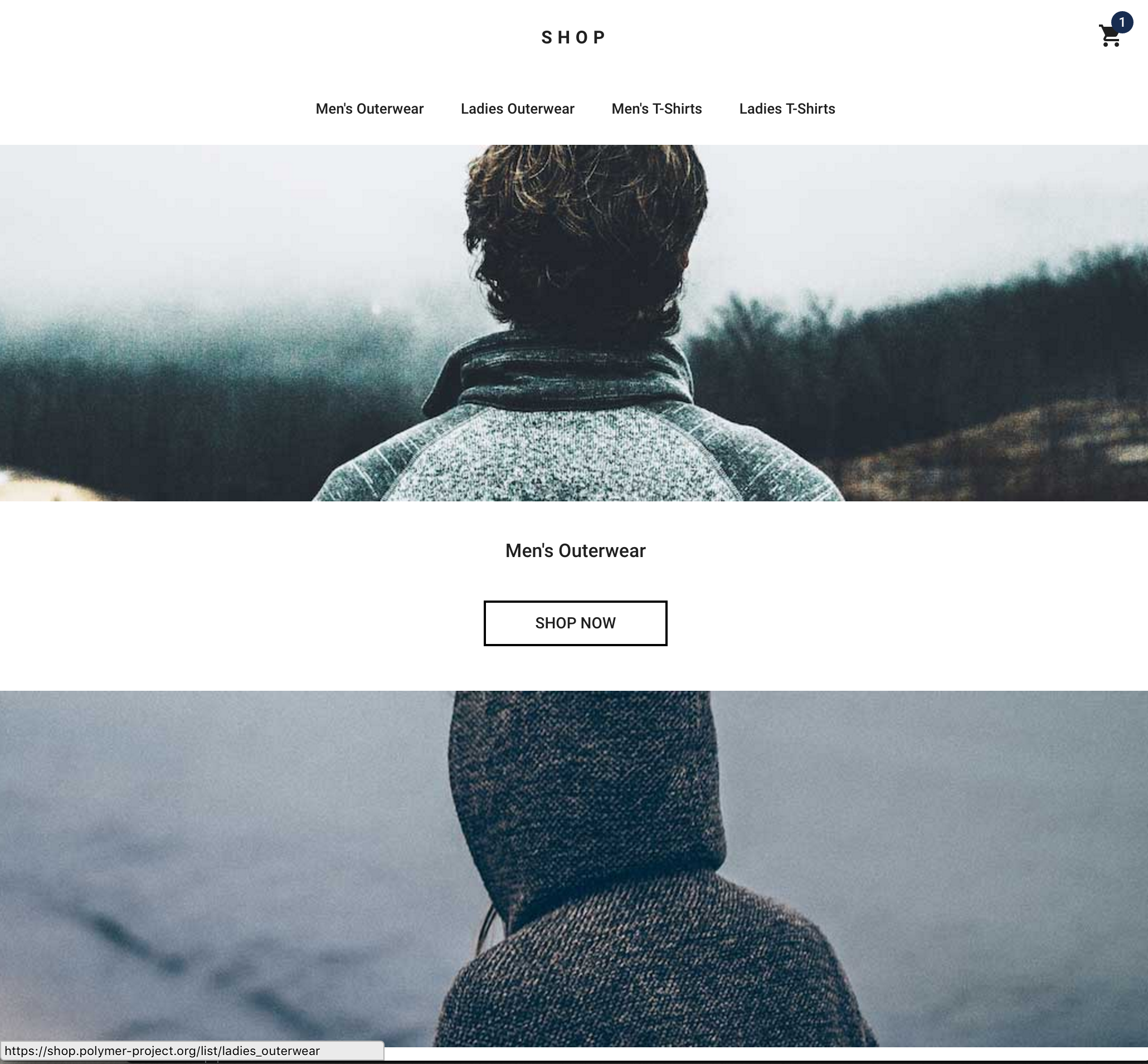
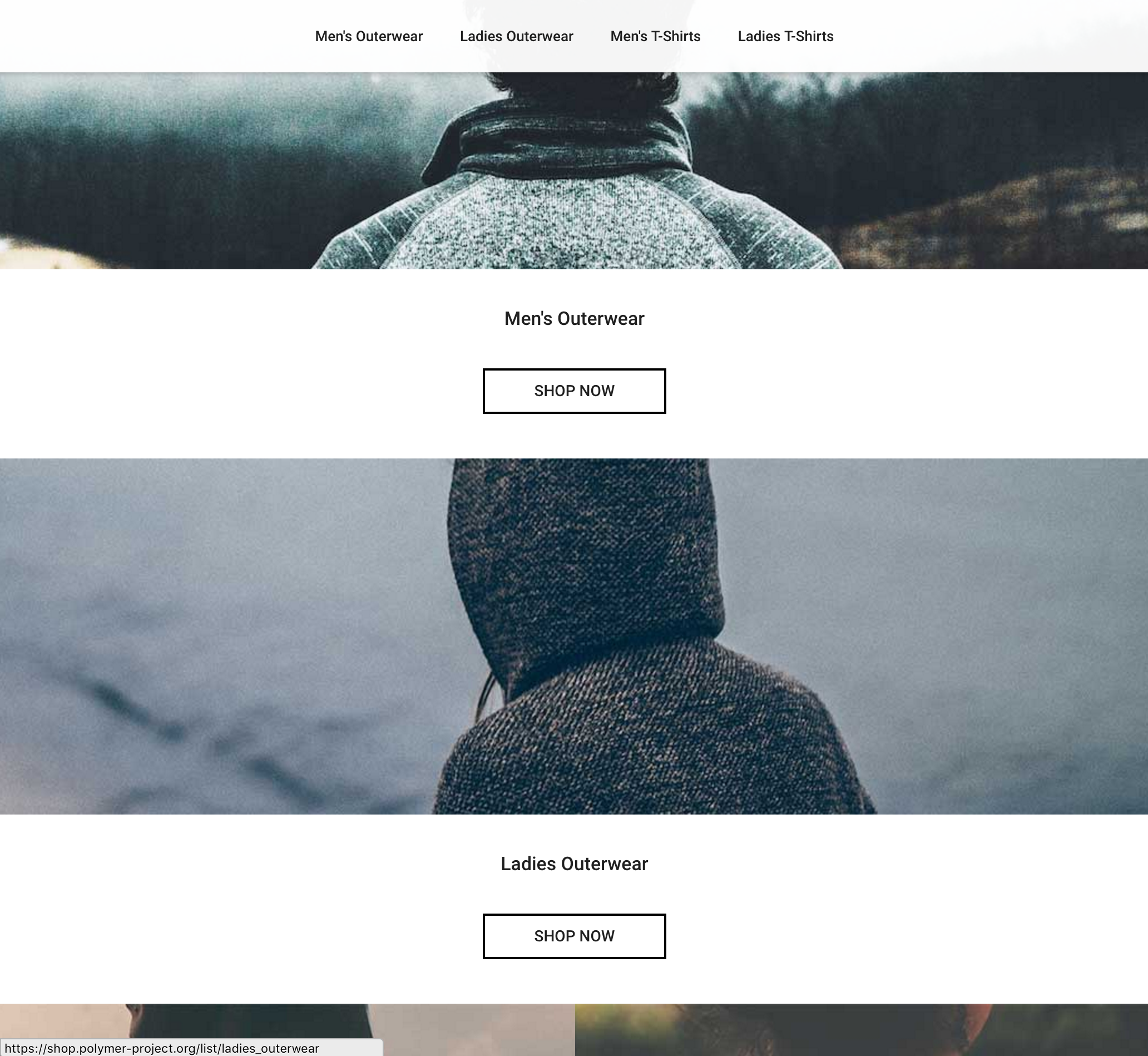
The tabs don't work as well on mobile devices, so Shop uses an <app-drawer> element as a navigation drawer, with a vertical menu.
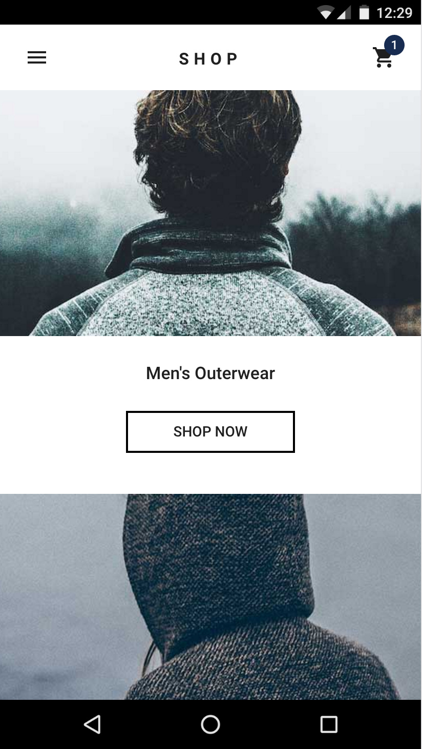
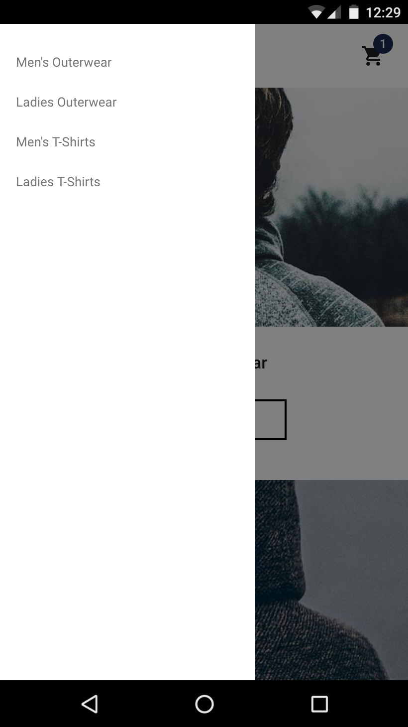
The app layout element set also includes simple container elements for
positioning headers and drawers: the <app-header-layout> and
<app-drawer-layout> elements.
More resources
If you want to look at the Shop app in more detail, you can find the full source on GitHub:


