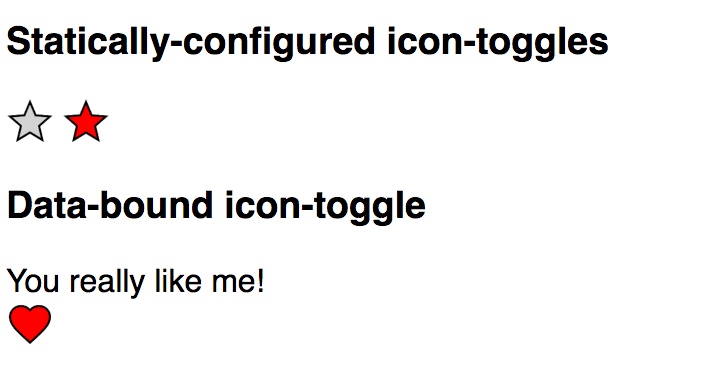
Shadow DOM helps prevent users from styling your element's internals by accident. To allow users to style your component, you can use custom CSS properties.
-
Inside your element, you create styles using the values of custom CSS properties.
-
Outside your element, users of the element assign values to the custom CSS properties that are used by your styles.
Step 5: Style an element with custom CSS properties
In this step, you'll:
If you want to learn how custom properties can be used to create a document-level theme, you can also:
Create styles using the values of custom CSS properties
In icon-toggle.js, inside the template function, edit the <style> block. Replace the values assigned to fill and stroke with custom properties.
Before
<style>
  :host {
    display: inline-block;
  }
  iron-icon {
    fill: rgba(0,0,0,0);
    stroke: currentcolor;
  }
  :host([pressed]) iron-icon {
    fill: currentcolor;
  }
</style>
After
<style>
  :host {
    display: inline-block;
  }
  iron-icon {
    fill: var(--icon-toggle-color, rgba(0,0,0,0));
    stroke: var(--icon-toggle-outline-color, currentcolor);
  }
  :host([pressed]) iron-icon {
    fill: var(--icon-toggle-pressed-color, currentcolor);
  }
</style>
Key information:
-
A custom property name must always start with two dashes (
--). -
Access the value of a custom property with the
varfunction, e.g.:iron-icon { fill: var(--icon-toggle-color); } -
You can add a default value, which will be used if the custom property is not defined:
iron-icon {
  fill: var(--icon-toggle-color, rgba(0,0,0,0));
}
Set values for custom properties
From the demo folder, open demo-element.js and set values for the new properties.
demo/demo-element.js: Before
<style>
  :host {
    font-family: sans-serif;
  }
</style>
demo/demo-element.js: After
<style>
  :host {
    font-family: sans-serif;
    --icon-toggle-color: lightgrey;
    --icon-toggle-outline-color: black;
    --icon-toggle-pressed-color: red;
  }
</style>
Key information:
-
Assign values to custom properties with a CSS rule. E.g.:
<style>
  :host {
    --icon-toggle-color: lightgrey;
  }
</style>
Run the demo again to get colorful!

That's it — your element is finished. You've created an element that has a basic UI, API, and custom styling properties.
If you have any trouble getting the element working, the icon-toggle-finished folder contains the final code.
If you'd like to learn a little more about custom properties, read on.
Extra credit: Set custom properties at the document level
You might want to create a theme for an entire application. One way to do this is to define custom properties at the document level, outside of your Polymer elements.
Because custom properties aren't built into most browsers yet, if you use them outside a Polymer element, you need to use a special custom-style tag.
Add the following code inside the <head> tag of demo/index.html:
demo/index.html
<custom-style>
  <style>
    /* Define a document-wide default */
    html {
      --icon-toggle-outline-color: red;
    }
    /* Override the value specified inside demo/demo-element.js */
    demo-element {
      --icon-toggle-pressed-color: blue;
    }
    /* This rule does not work! */
    body {
      --icon-toggle-color: purple;
    }
  </style>
</custom-style>
Key information:
-
The
htmlselector matches the root HTML document element indemo/index.html. The custom property value defined in thehtml {...}rule indemo/index.htmlacts as a default and will be inherited by any elements in its scope. -
The
demo-elementselector matches the<demo-element>element and has a higher specificity than the:hostselector insidedemo-element. You can use this fact to specify your own values for custom properties that the author of a custom element has defined inside that custom element, without altering the element's code. -
Custom properties can only be defined in rule-sets that match the
htmlselector or a Polymer custom element. This is a limitation of the Polymer implementation of custom properties. -
Elements must be in the same document scope as the
<custom-style>for selectors defined in a<custom-style>to match them. Elements inside another element's shadow DOM are not in main document scope.For example, in the diagram below,
<demo-element>is in the same scope as a<custom-style>indemo/index.html, while<iron-icon>and<icon-toggle>are not.demo/index.html DOM tree
<html>
  <demo-element>
    #shadow-root
      <icon-toggle>
        #shadow-root
          <iron-icon>
Using the DOM tree above, the selectors in the following code sample will find a match:
demo/index.html
<custom-style>
  <style>
    html { ... }
    demo-element { ... }
  </style>
</custom-style>
<demo-element></demo-element>
The selectors in the following code sample, however, will not find a match:
demo/index.html
<custom-style>
  <style>
    iron-icon { ... }
    icon-toggle { ... }
  </style>
</custom-style>
<demo-element></demo-element>
For more information, see the documentation on custom CSS properties.
Next steps
-
Ready to get started on your own element? You can use the Polymer CLI to Create an element project.
-
You can also Create an application project to get started building an application with the Polymer library.
Or review the previous section:
Previous Step: React to input
