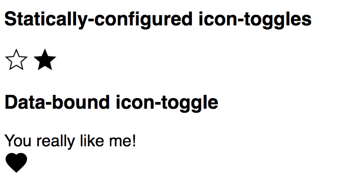
Of course, a button isn't a button if you can't click it. In this step, we'll make the icons react to input.
Step 4: React to input
In this step, you'll:
Add an event listener
To toggle the button, we will add an event listener. In icon-toggle.js, add the following line of code to the constructor:
this.addEventListener('click', this.toggle.bind(this));
Before
constructor() {
  super();
}
After
constructor() {
  super();
  this.addEventListener('click', this.toggle.bind(this));
}
When the 'click' event fires, a callback function (toggle) is triggered.
Define the callback for your event listener
Now you need to define the callback function, toggle. In icon-toggle.js, in the IconToggle class definition, add the following function after the constructor:
toggle() {
  this.pressed = !this.pressed;
}
Before
class IconToggle extends PolymerElement {
  static get template() {
    ...
  }
  static get properties() {
    ...
  }
  constructor() {
    ...
  }
After
class IconToggle extends PolymerElement {
  static get template() {
    ...
  }
  static get properties() {
    ...
  }
  constructor() {
    ...
  }
  toggle() {
    this.pressed = !this.pressed;
  }
Key information:
-
Use the standard
addEventListenermethod to add event listeners imperatively. -
An element's constructor is a good place to add event listeners.
-
Make sure you are aware of the scope of the
thisvalue when referencingthisfrom inside a function that gets passed as an argument, like a callback. In the code above, we have handled scope by binding thethisvalue (this.toggle.bind(this)), but you could alternately handle it by using ES6 arrow functions.
Save icon-toggle.js and reload the demo. You should be able to press the button and see it toggle between its pressed and unpressed states.

Next, learn to style your elements with custom CSS properties in step 5.
Previous step: Use data binding and properties Next step: Theming with custom CSS properties
